Project Details

Industry:
Healthcare
Client:
Agiva Solutions
Tool:
Sketch/Figma
Agiva Solutions - Creating a health insurance member dashboard from scratch.
Agiva is a U.S.-based insurance provider offering dental and vision coverage with an annual deductible and annual maximum to help members manage routine care costs and reduce out‑of‑pocket expenses. The structure makes it easier for members to stay proactive about their everyday health needs.
The Challenge
Agiva faced several usability and experience challenges that impacted both members and internal operations. Policyholders often struggled to understand their supplemental benefits, including coverage details, remaining balances, and authorization status, which led to confusion and a lack of confidence in their plans.

Our High-Level Goals Were To:
Create a single source of truth for all member benefits and activity.
Simplify complex insurance information into a clear, self-service experience.
Support family-level benefit management in one unified experience.
Improve member confidence and engagement throughout the coverage lifecycle.
My Role
I led the design work on this project over two years, collaborating closely with a small design team, our PM, researchers, and customer success partners. I shaped the core experience, created the main designs, and worked with engineering to make sure everything was built the way we intended.
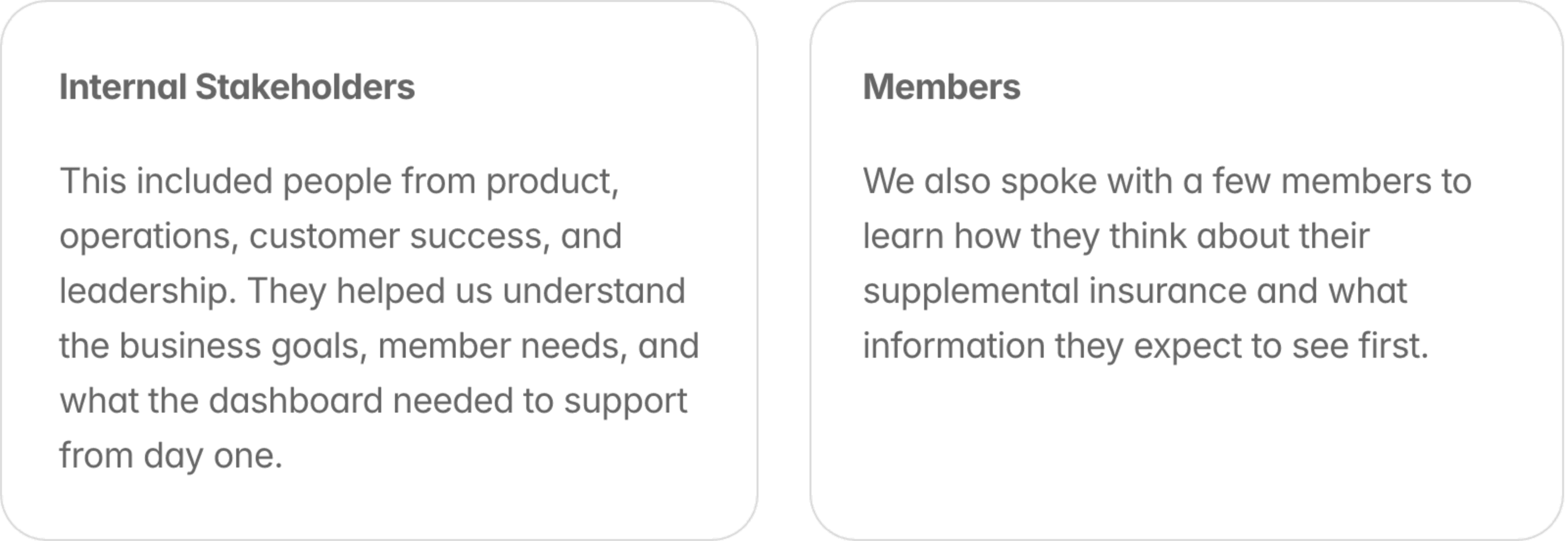
Generative Research
We started by talking with stakeholders across the company to understand what the dashboard needed to solve. Our UX researcher led interviews and shared insights, and we paired that with common questions from customer success to pinpoint where members were getting confused about their benefits.
Early Design Work
First, I started with designs that would unblock our backend engineers, since they needed extra time to build the data systems. We focused on the hardest feature first: claims tracking. By designing this early, we gave the backend team a clear plan to build while we continued working on the rest of the dashboard.

I walked the engineering team through the flows, answered their questions, and clarified any areas that needed more detail so they could start planning the backend work.
Narrowing Scope
With limited time and engineering resources, we had to be very selective about what we built first. We focused on the features that delivered the most value to members and were essential for the business. After reviewing stakeholder input and early research, we narrowed the scope to four core areas:
Claims tracking
The most important and complex feature. Members needed a clear way to see every stage of their claim, from processing to approved or denied. This required significant backend work, so we prioritized it early.
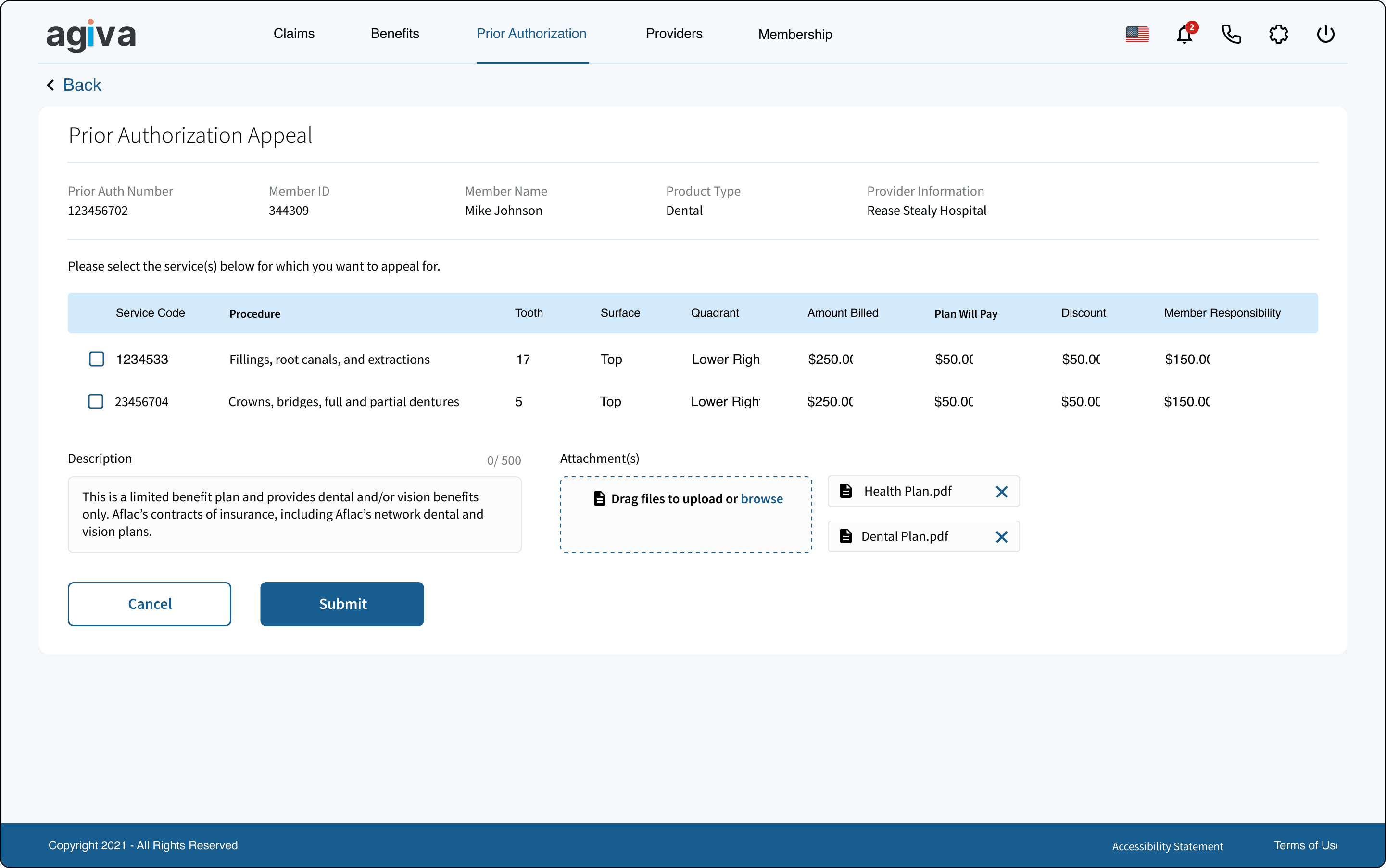
Prior authorizations
Members often need to know whether a service requires approval before they use it. We included a simple way for them to view the status of their prior authorization requests so they could avoid surprises.
Benefits
We needed a clear place for members to understand their benefits. We focused on showing the essentials: coverage type, plan name, coverage status, and benefits consumption.
Building a Foundation
Design system
We started by building the core pieces of the Agiva design system. This included our color system, icon library and a set of custom components that we knew we’d use across multiple features.
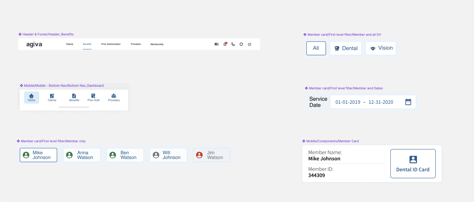
I designed elements like the top bar, summary cards, placeholders (including error/disabled states), the switch CTA, and the date picker. Having these components in place early helped us stay consistent and move faster as we built out the rest of the experience.

First Concept Test
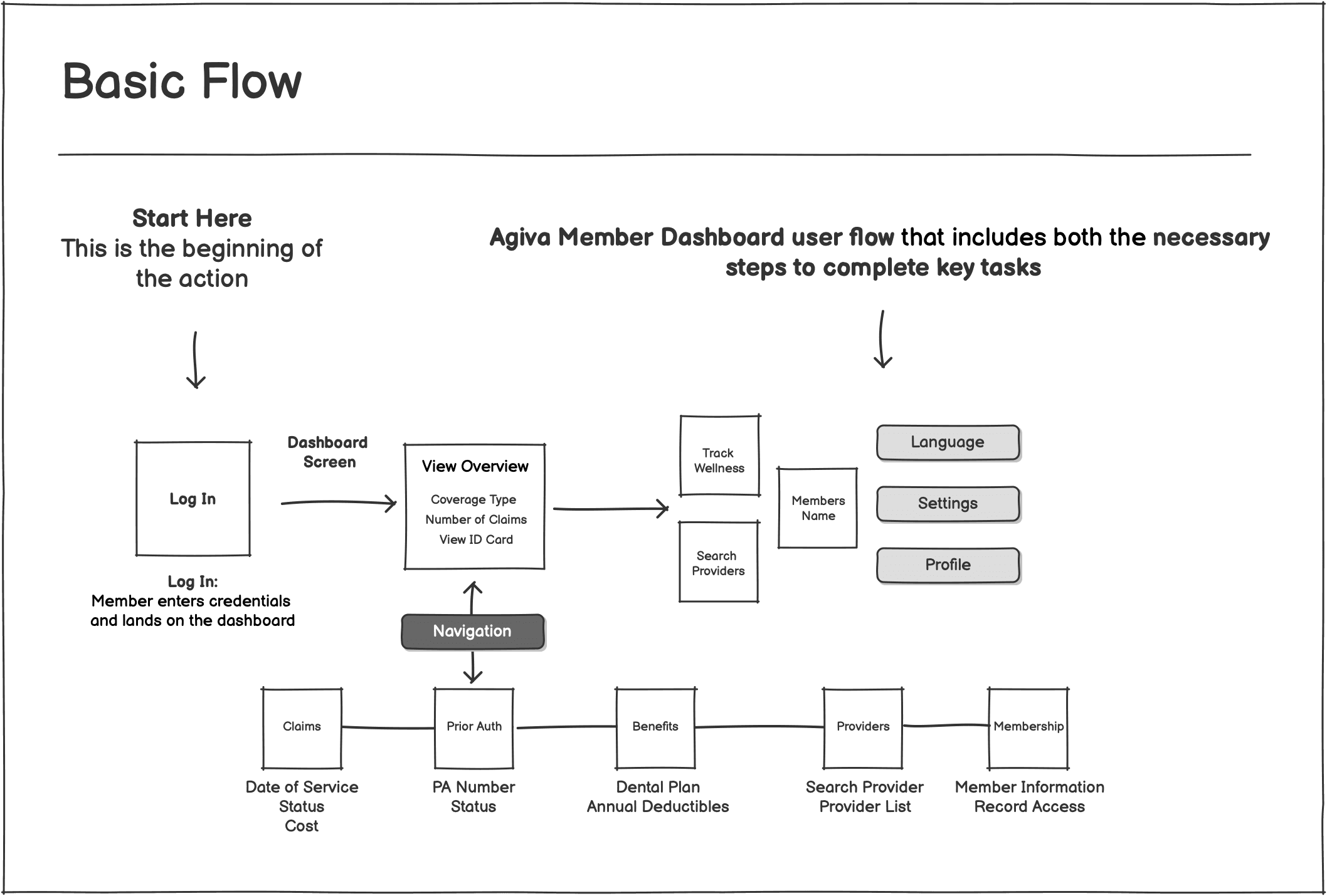
We started by designing the landing dashboard. We worked on the whiteboarding session to map out what the feature needed and how members would move through it. The dashboard included:
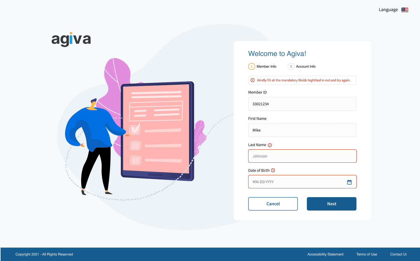
Registration
Logging in
Viewing active members
Viewing an ID card
Searching for providers (in‑network and out‑of‑network)
Profile settings

Our main goal at this stage was to validate whether the experience was usable and intuitive. We also shared this first concept with stakeholders to make sure we were aligned on direction.
Final Designs
With the core flows, information architecture, and design system in place, I translated the work into a fully responsive interface across desktop and mobile.
Desktop Experience
On desktop,quick access to the most important information:
Top navigation for quick access to Claims, Prior Authorizations, Appeals, Benefits, and Profile
Flexible grid system that adapts to different content types
Clear, consistent patterns for labels, statuses, and timestamps
Redesigned claim and benefits details with stronger hierarchy and spacing
Contextual actions placed exactly where members need them (ID card, downloads, status checks)
Claims
Prior Auth
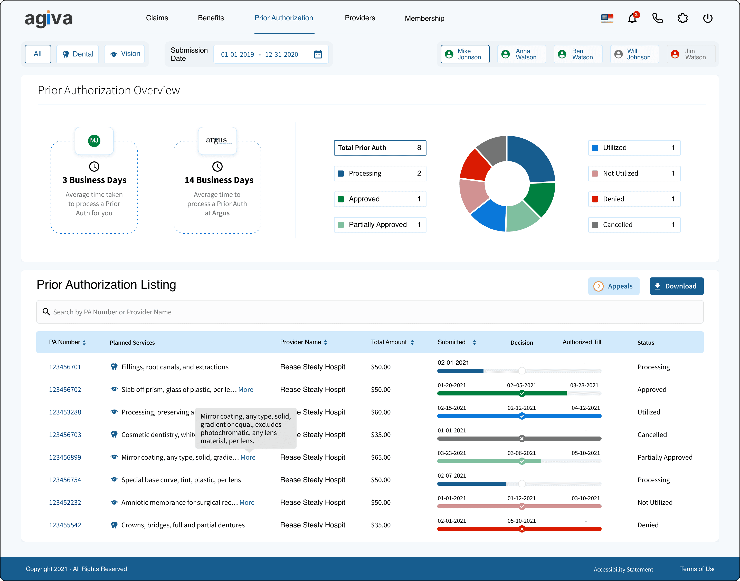
Appeals
Benefits

Mobile Experience
The mobile design prioritizes speed, readability, and ease of use for members who are often checking claim status or benefits on the go.
Key improvements include:
Simplified mobile navigation with quick access to high‑value features
Scannable card layouts that keep hierarchy clear at smaller sizes
Improved readability with better spacing, line heights, and status indicators
Key actions placed where members naturally pause (like View ID Card or Download)
Tap‑friendly interactions for filtering, expanding details, and moving through claim stages

The mobile experience mirrors the principles of the desktop design while optimizing for real‑world usage—fast checks, quick updates, and clear next steps.
Preparing Designs for Engineering
For this project, we followed a consistent and detailed approach to preparing designs for engineering. Our goal was to make sure every screen was fully thought through—not just visually, but in terms of behavior, edge cases, and responsiveness.
For each screen, we documented up to seven possible states:
Ideal
Empty
Partial
Loading
Error
Success
Responsive breakpoints


Not every screen required all seven states, and some needed multiple variations of the same state. But we evaluated each one to ensure the engineering team had complete clarity on how the interface should behave in different scenarios.
We organized the designs in two ways:
By state, arranged in a grid
This made it easy for engineers to compare how a screen adapted across different conditions.As complete flows
These included click zones, documented interactions, and the exact order of steps so engineers could understand how the experience worked end‑to‑end.

Accessibility
Accessibility was a core part of how we approached the member dashboard. Early in the project, our team created an internal accessibility checklist to ensure every feature met a consistent standard.
A few highlights from our accessibility considerations:
Clear, plain language to support members with dyslexia or low literacy
Color‑blind‑friendly palettes and WCAG‑compliant contrast ratios across all components
Avoiding hover‑dependent interactions, ensuring that key actions are always visible and accessible.
Alt‑text for images or adjacent headings that convey the same meaning
Defined focus states for all interactive components, ensuring screen‑reader users can navigate confidently (including special handling for components like dropdowns that behave differently on focus vs. hover)
Minimal use of animations to support members with vestibular disorders or low vision
Results
The response after launch was overwhelmingly positive. In early rollout conversations, members and internal stakeholders consistently shared how valuable it was to finally have all key visibility features in one place and available on‑demand.
Internally, the dashboard created meaningful operational improvements. Our customer support team reported that the new transparency and self‑service tools saved them hours each week, allowing them to focus on higher‑value work instead of answering repetitive questions about claim status or coverage details.