Project Details

Industry:
Insurance
Client:
BrokerHub
Tool:
Lovable AI
AI-Assisted Broker Commission Dashboard
Project Overview
This project explores how AI-powered design tools like Lovable can be integrated into the UX design process to accelerate ideation, structure complex data, and support faster decision-making.
What This Dashboard Is For
This dashboard is designed for insurance brokers and sales agents to quickly understand their commission earnings, track payment status, and take action on overdue premiums and pending enrollments. It brings financial performance, client insights, and alerts into one clear, easy-to-scan view.
Why AI (Lovable) in This Project?
Modern design workflows are increasingly augmented by AI tools. Instead of replacing designers, tools like Lovable help:

Rapidly generate layout ideas for data-heavy interfaces
Explore multiple dashboard structures early in the process
Reduce time spent on repetitive UI pieces.
Allow designers to focus more on UX logic, prioritization, and decision-making
This case study demonstrates how I used Lovable AI as a co-creation tool, while maintaining full ownership of UX strategy and design decisions.
My Role
As a UI/UX Designer using an AI-assisted workflow, I defined the design goals and overall structure of the dashboard. I used Lovable AI to quickly explore layout ideas and data visualizations, then refined those designs based on user needs, clear data hierarchy, and real broker workflows.
Early Design Work
Problem Statement
Insurance brokers work with many client groups and insurance products at the same time. Important information such as total commission, paid and pending amounts, overdue premiums, and pending enrollments is often spread across different tools or reports. This makes it hard for brokers to quickly understand their performance and know where to take action.

Design Goals
The challenge was to design a single, clear dashboard that gives brokers instant visibility into their earnings, highlights urgent issues, and helps them manage clients and commissions more efficiently.
Provide at-a-glance financial clarity (total, paid, pending commissions)
Highlight urgent actions such as overdue payments and pending enrollments
Enable trend analysis across products and time
Reduce manual effort in tracking commissions
Demonstrate how AI tools can support faster dashboard creation while maintaining UX quality
How I Used Lovable AI in the Design Process
Lovable AI was used in the early design phase to quickly generate multiple dashboard layout ideas using high-level prompts such as “broker commission dashboard,” “financial performance overview with alerts,” and “data-heavy SaaS interface.” This helped speed up ideation, explore different structural approaches, and avoid starting from a blank canvas, allowing more time to focus on UX decisions and refinement.

Human-Led UX Decision Making
Although Lovable AI helped generate initial layout ideas, all key UX decisions were made intentionally by me. I decided what information should appear first, how commission data should be grouped, which alerts needed stronger visual emphasis, and how to balance high-level summaries with detailed insights. AI outputs were used as a starting point, while final decisions were guided by user needs, clarity, and real broker workflows.
Iteration & Refinement
I refined the designs to improve clarity and usability. I reworked the information architecture to make key data easier to understand, simplified complex visuals, and adjusted color usage to clearly differentiate paid, pending, and overdue states. I also added clear contextual cues and call-to-action buttons to help users quickly take the right actions.

Final Screens
Dashboard
This dashboard gives insurance brokers a quick, clear snapshot of their commissions and group performance. I focused on strong visual hierarchy so key financials and trends stand out immediately.
Charts and alerts highlight what needs attention without extra digging. The overall layout is built to support fast decision‑making and reduce daily friction for busy brokers.

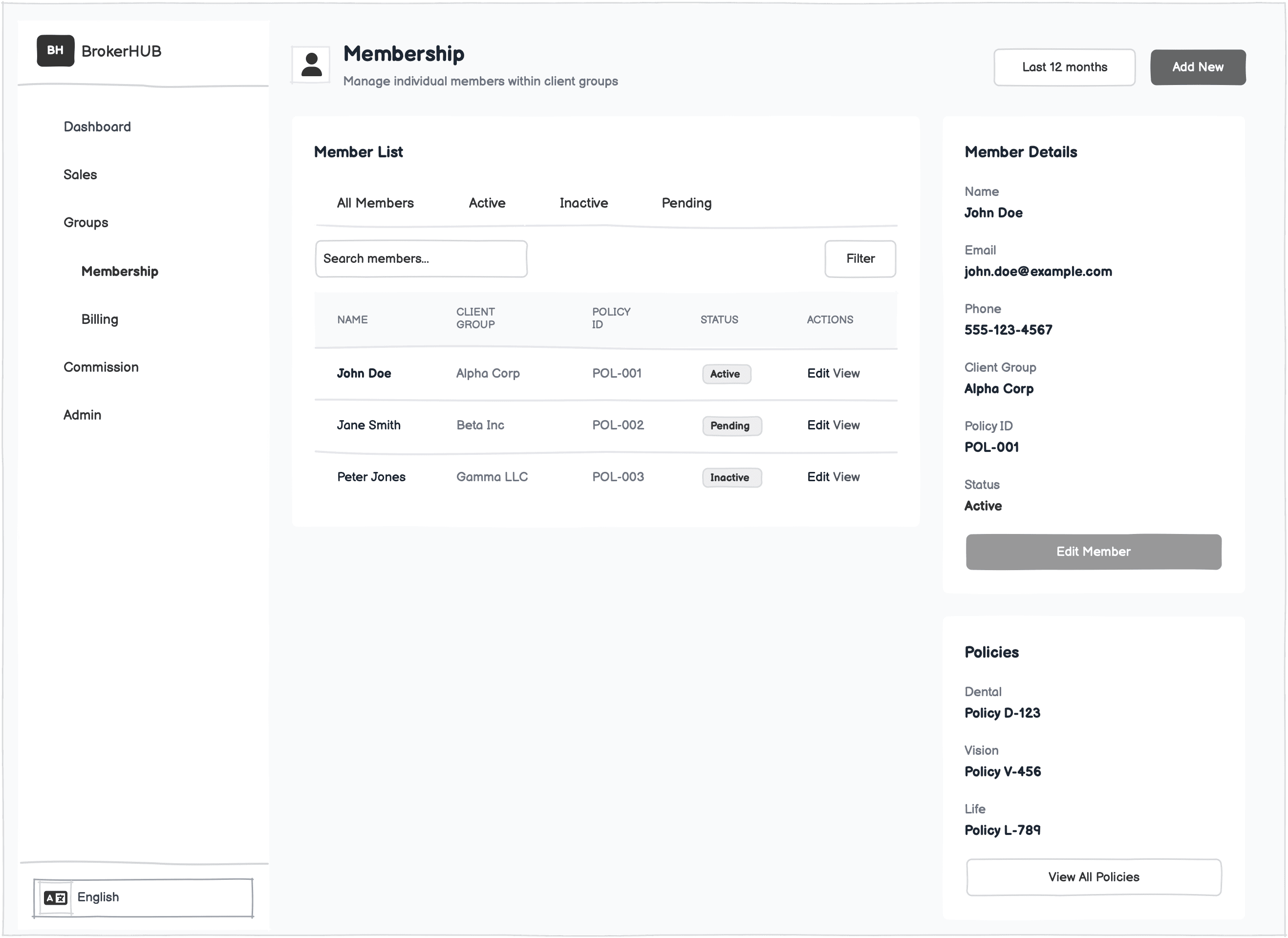
Membership
Membership view to give insurance admins a clear, centralized snapshot of an individual’s coverage, contact info, and employment details. Tabs enable quick access to related data like claims and authorizations, while coverage cards surface key details: status, tier, and dates at a glance.
The layout supports fast lookups and confident action, whether reviewing eligibility or updating member records.

Billing
To help admins quickly see what’s been billed, what’s been paid, and what’s overdue. The top summary gives an instant read on overall status, and the table breaks everything down by invoice so issues are easy to spot.
It keeps the workflow simple and helps teams stay on top of payments without digging around.

Notifications
Notifications to help admins quickly spot overdue payments and other key updates. The summary shows how many alerts are unread or high priority, and each card gives clear details with quick links to follow up. It’s built for fast scanning and action, no digging required.

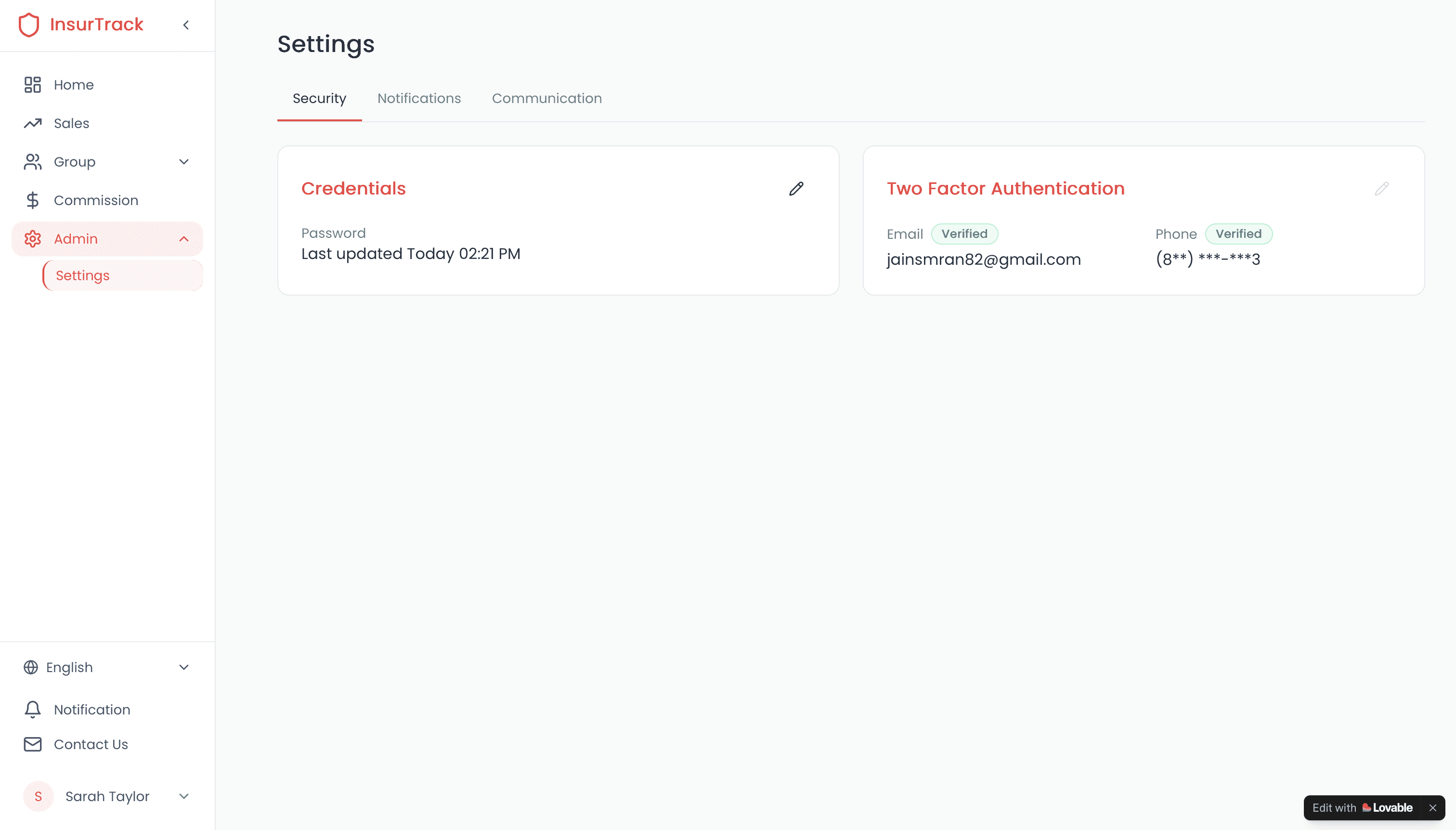
Settings
Settings view to make it easy for users to check and manage their login info. It shows when the password was last updated and confirms two-factor setup for email and phone. Everything’s clear, quick to scan, and built to support trust and account safety.
What Was Challenging While Designing in Lovable.ai
I designed all these screens using Lovable.ai, which helped me move quickly but came with several constraints.
Customizing spacing, styling, and responsive behavior was limited, making it harder to fine‑tune layouts.
Iterating quickly on detailed flows or micro‑interactions required extra workarounds.
Creating more complex interactions, edge‑case states, and detailed flows wasn’t always supported.
Screens couldn’t be imported into Figma.
Complex interactions, hover states, and edge‑case scenarios were difficult to represent accurately.
Despite these constraints, I focused on clarity, hierarchy, and usability to ensure the final experience still felt polished and intuitive.
Personal Takeaway
Using Lovable.ai made the early design work way faster for me. It gave me quick layouts and components to start with, so I wasn’t stuck staring at a blank screen. It helped me try out ideas fast and see the user flow before polishing anything.